 In this assignment, I used Photoshop to learn how to make Andy Warhol based images. First, I cropped the first image of me down to the square (1/1) option, then did Threshold in the Adjustments option, and then used the magic wand tool to select the white. I then chose two colors, used one to color the white, and then erased around me to reveal the secondary color. I then extended the canvas size, duplicating my image and just changing the colors around. After that, I chose a third color to be the "highlight" and chose to highlight my eyes.
Composition wise, it was pretty simple. The only thing I really chose was the image of me and the colors. I honestly chose a pretty random image of me and just used that. Color-wise, for the top layer I chose some complimentary colors (purple and yellow) and just changed where it went every time. For the second layer, I chose a magenta and green color, and the last, some cyans/greens/blues. Then for the highlight, I decided I wanted a color that would stand out against most of them, so I chose yellow. The only one it doesn't really stand out against is the top middle one because I'm also yellow, but it stands out pretty well against everything else, so I think it works. I didn't want to choose white because one of the starter colors was white and it might not have been as noticeable.
0 Comments
 TEXTURE - I could see that the wall had a very distinct look, and the texture was very obvious, even in pictures. The way I would describe it is a "popcorn ceiling" texture. LINE - The stairwell sign had the perfect example for line, because even though it wasn't a straight line, it was a very good example of a zig-zag. Whenever I look at that specific picture, it's the first thing my eye goes to. COLOR - The statue is very colorful and has a large variety of colors. The colors aren't dulled out or super pastel, but the right amount of bold. FORM - this is an okay example of form, because if I looked at an example of a cylinders form, I would see that it's relatively similar. Even if it's just a pillar, you can see that the bottom part is much more shaded, and there's a brighter part near the top. SHAPE - This is a sign that I found with the perfect example of a flat form. SCALE - The cups on the ground get smaller the farther away you are, and even though it's subtle, even in this image there is a larger cup in front and smaller cups in the back. SPACE - There is an almost warped perspective of the door, and it looks very far away.  ALIGNMENT - The rock shown is basically in the middle of the image, and it lines up with the doors as well.
CONTRAST - The purple flower is clearly visible against the green background. PATTERN - The circles continue evenly throughout the whole image. UNITY - Everything is meant to be there and works together as an even image. PROPORTION - We can see the rocks getting smaller and smaller as we are farther away. EMPHASIS - The first thing my eye goes to in the image is the gray iron, as it's more visible against the red, and the attention is more on it. BALANCE - this is asymmetrical image, because the bottom looks like it'd be even because of the shapes, but the images are different and we can see that the top has more space than the bottom. RHYTHM - there is kind of a pattern, but instead of it being the same throughout the whole image, there is a lot of the same shapes, but not symmetrical. Out of all of the coloring pages, I think the one that works the best is the monochromatic color scheme. I know the idea wasn't to be realistic, or that there is no way to be exactly realistic since this animal doesn't exist, but I think if it did it's "color scheme" might look something like this. It's majorly some brownish colors, but it has some yellowish ones as well which is perfect, especially for the beak and claws. For the split complementary color one, I think the thing that works best was the bluish color as the mountains and the ground. It's not exactly "realistic" but for a rock color, it works pretty well. The analogous color one, I don't like it as much. I like some of the colors, but at the same time for the coloring image I don't know if it goes well. The complementary colors was probably my least favorite one, because I had to use two palettes and they don't look amazing together. 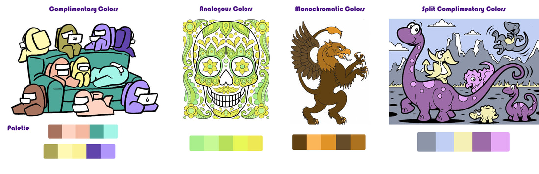 |
